
Visual Identity
Visual Identity
The rules governing RIMAN's logo, colours and typefaces. This site follows them too.
Brand colours
RIMAN has two base colours. The primary logo colour is RIMAN CLASSY DEEP GREEN (PANTONE 4209 C); the secondary is ICD LIGHT GREEN (PANTONE 5517 C). Deep green is used for the header, titles and primary buttons; light green for background tones and dividers.
Colour specification
- RIMAN CLASSY DEEP GREEN
- PANTONE 4209 C · #2D5849 · primary logo colour
- ICD LIGHT GREEN
- PANTONE 5517 C · #BBC6C0 · secondary logo colour
- Korean typeface
- Pretendard
- Latin typeface
- Montserrat
Source: the RIMAN C.I. Manual. GREEN BEE (#078E51) was retired in February 2025 and is not used in new material. Campton, the dedicated Latin typeface, may not be used on web or digital channels under the manual.
Design partners
RIMAN's brand identity was built with outside specialists.
Pentagram
In 2025 we worked with the global design firm Pentagram to renew the packaging across our range and the brand logo. The packaging expresses our heritage ingredients — GiantBYoungPool™ and Jeju lava seawater — and shifted to a “greenish ivory” that reflects the fresh colour of GiantBYoungPool™.
Interbrand
A brand consultancy that has led brand strategy for global companies since its founding in 1974. For RIMAN it advised on strengthening global brand strategy and building a premium image.
Cheil Worldwide
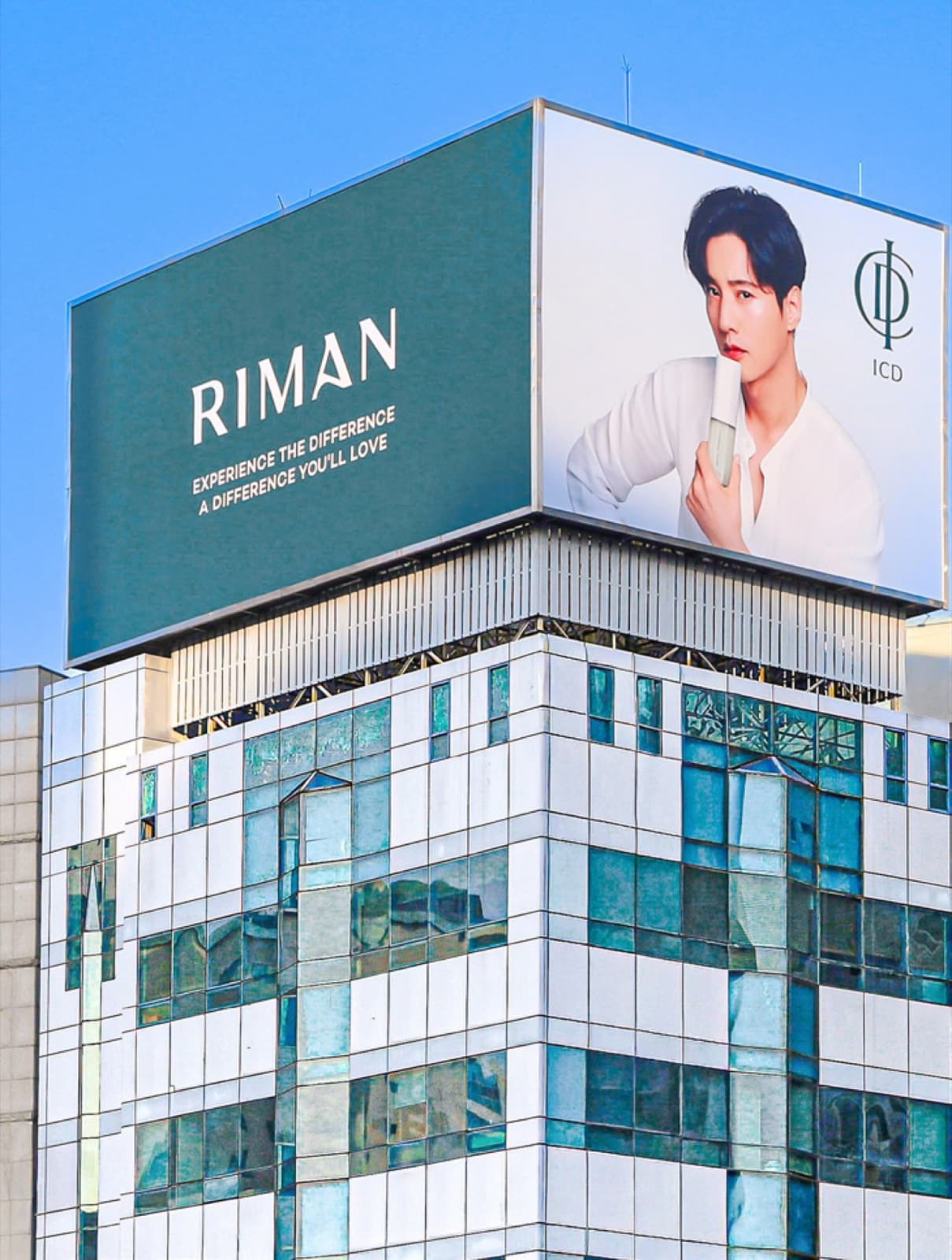
Korea's largest full-service advertising agency, which produced ICD's new advertising campaign. It features brand model Won Bin alongside our signature ingredient GiantBYoungPool™ and views of RIMAN FARM.